Branding Refresh.
Jalisco Tacos is a beloved restaurant, but the logo was due for an update. This rebrand had an objective of creating a new brand identity without sacrificing the character of the brand.
But, why?
Named after a municipality in Mexico, Jalisco Tacos prides itself on serving authentic, delicious food to its community. While researching Jalisco, Mexico, I discovered its landmark church and found inspiration in the beautiful stained glass.
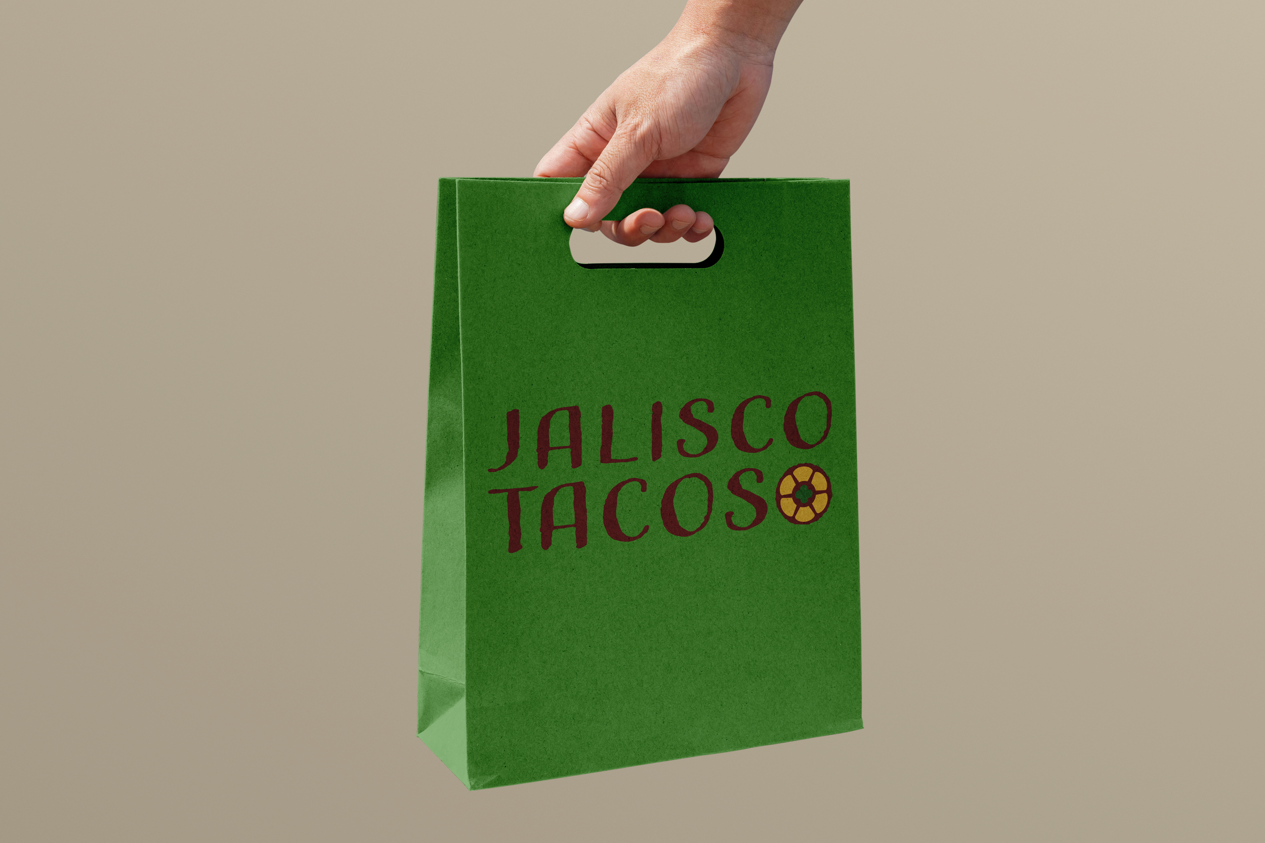
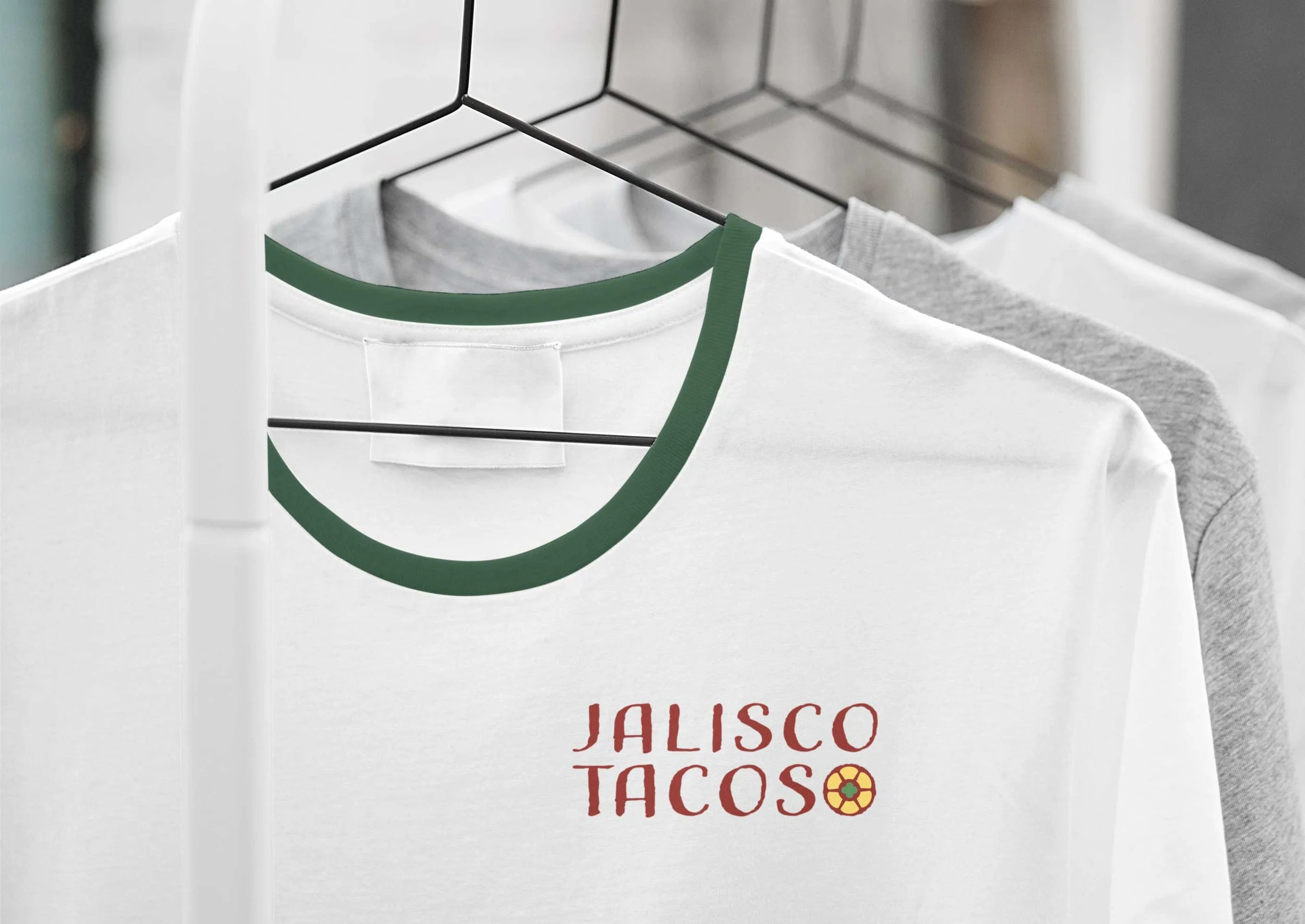
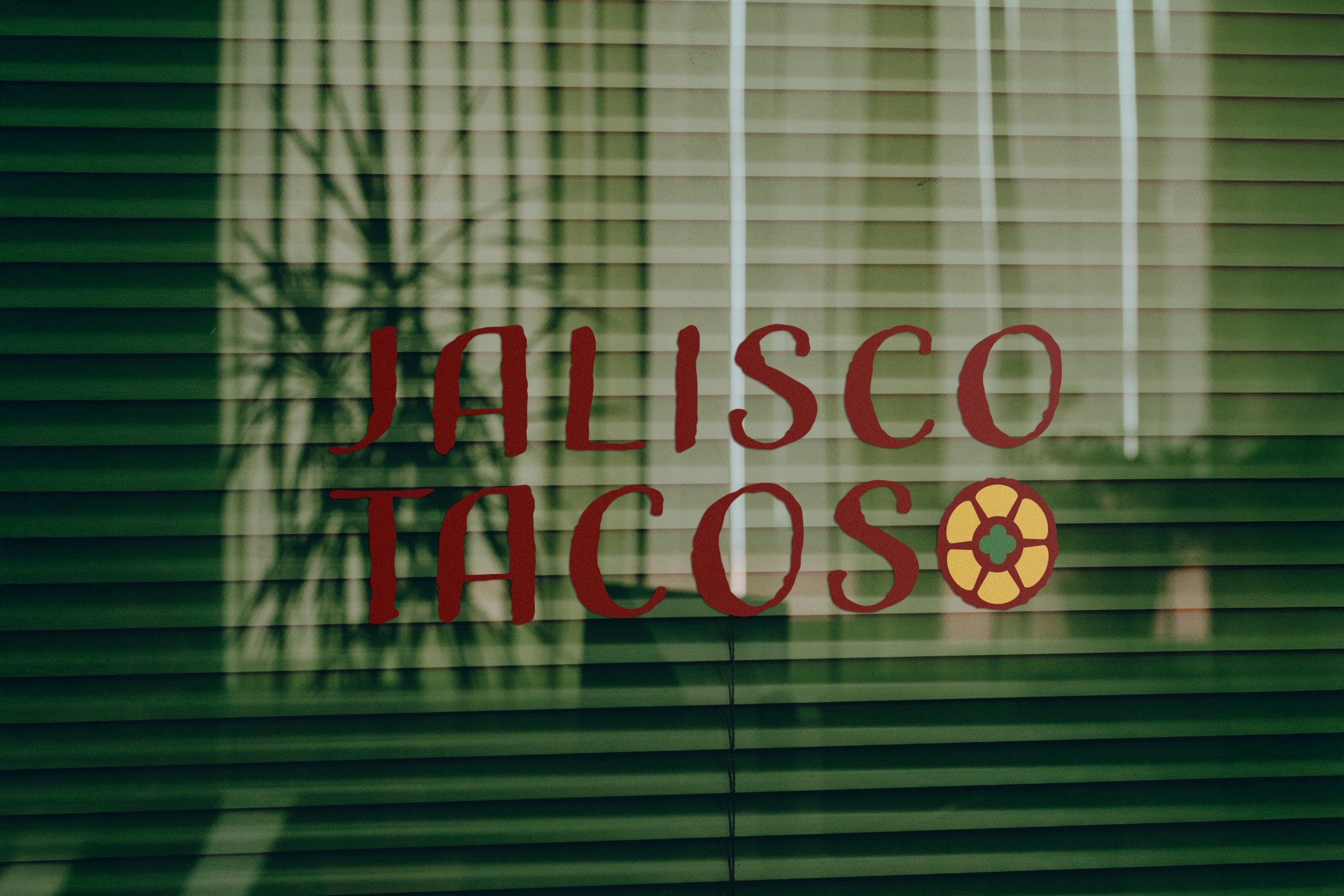
Using shapes inspired by the stained glass windows, I created a logo with a pictorial element. The versatile shape looks like chips being dipped in guacamole in full color, but transforms into a cut lime when altered to green.
The color palette was picked from the decor inside the restaurant, and the rough texture drew inspiration from the textured feature wall in the dining area.