Chef Abdul Mediterranean
Chef Abdul’s restaurant has been growing in popularity for the last few years. Despite all the new attention, this small business still didn’t have a logo and was ready for a step into it’s future.
To choose the perfect color palette, I took time to consider what colors are stereotypically associated with a mediterranean restaurant. Most often, bright whites and deep blues are seen but I didn’t want this restaurant to match the competition, I wanted them to be a step above it. Keeping this in mind, I took pictures of some of the dishes served here and pulled greens and golds to add. This was a great way to expand the palette while keeping it true to the client.
The Color Palette
Creating a logo from scratch always presents a fantastic creative challenge. This logo was particularly fun for me to do as I really got the chance to imbue it with the fun and friendly atmosphere that is all around this store. At the time, they were using a photo of the owner and head chef as a logo. I loved how present his image was throughout the entire restaurant and didn’t want to lose that feeling.
At first I found myself stuck with a little bit of art block. I tried so many options but found my logo where I least expected it: in a small doodle I drew of Chef Abdul himself. Once I had the line art cleaned up and rendered, I knew this was the perfect logo.
The Logo
I spent some time testing different line weights, colors, and facial feature styles until I landed on the classic black and white logo. I was easily visible on any background and would be perfect to print on any medium. After peer review and affirmation, I got started on my next challenge.
The Business Cards
The business card design came naturally after the menu was created. I incorporated the elements used in the menu to make a matching business card. I chose a round edge business card because in my time working a for print companies, I found them to be longer lasting than a traditional square business card. Also a rounded edge is better fitting for the playful feeling of the design.
Part of this restaurant’s popularity comes from it’s expansive menu. The original menu had all of these amazing choices, but was cluttered and hard to read. Using the new palette and logo, I got my basic layout set. I tried many different font families and styles on the menu before deciding that a typewriter style font had a fun feeling and good readability.
I used the lighter blue to keep everything easy to read but add a pop of color. Then, I decided to emphasize the different sections of the menu by creating larger headers with a white background.
Once the front was together, it was time to add more pizazz to the back. I wanted something simple, but that made sense. To achieve this, I drew olive branches to create a pseudo border.
The Menu
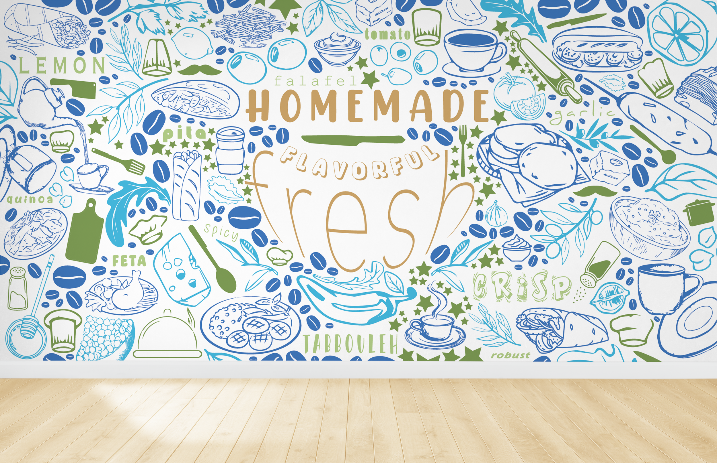
Creating the mural was my favorite part of this assignment. I wanted to create a design that was a busy statement piece, but was still pleasant to look at. I spent y time finding images of meals from the restaurant, studying the common ingredients, and brainstorming. Then, I began drawing out different foods they offered. Sticking to the palette, I made each category of items one of the colors to keep it from being too overwhelming. I had fun with fonts, choosing a new one to encapsulate the feeling of each word.
I felt the mural was the perfect thing to tie together this restaurant revamp because it kept the busy-ness of the decor while simplifying it to something that would not only bring fun into the store, but could even be the perfect place for customers to get their social media moment and increase business.